-
Company
William Joseph Communications
-
Client
Canadian Lentils
-
Project Date
October 2015
-
Location
Calgary, Canada
-
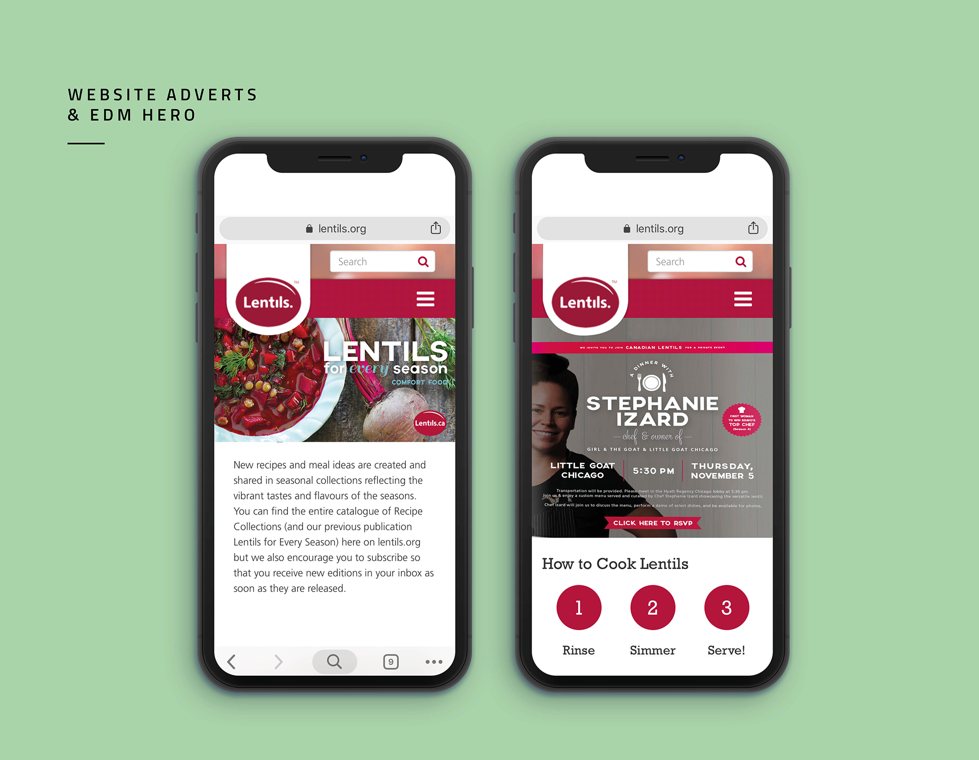
Assets Created
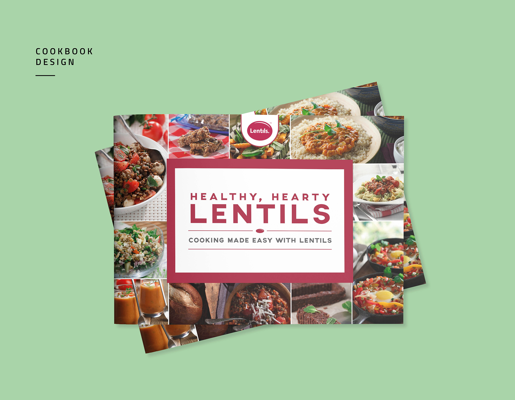
Cookbook
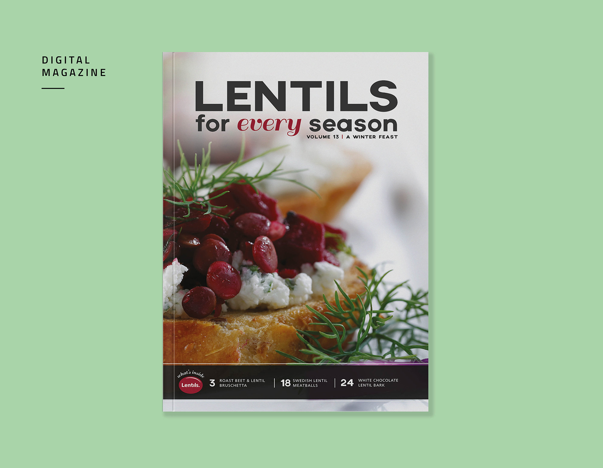
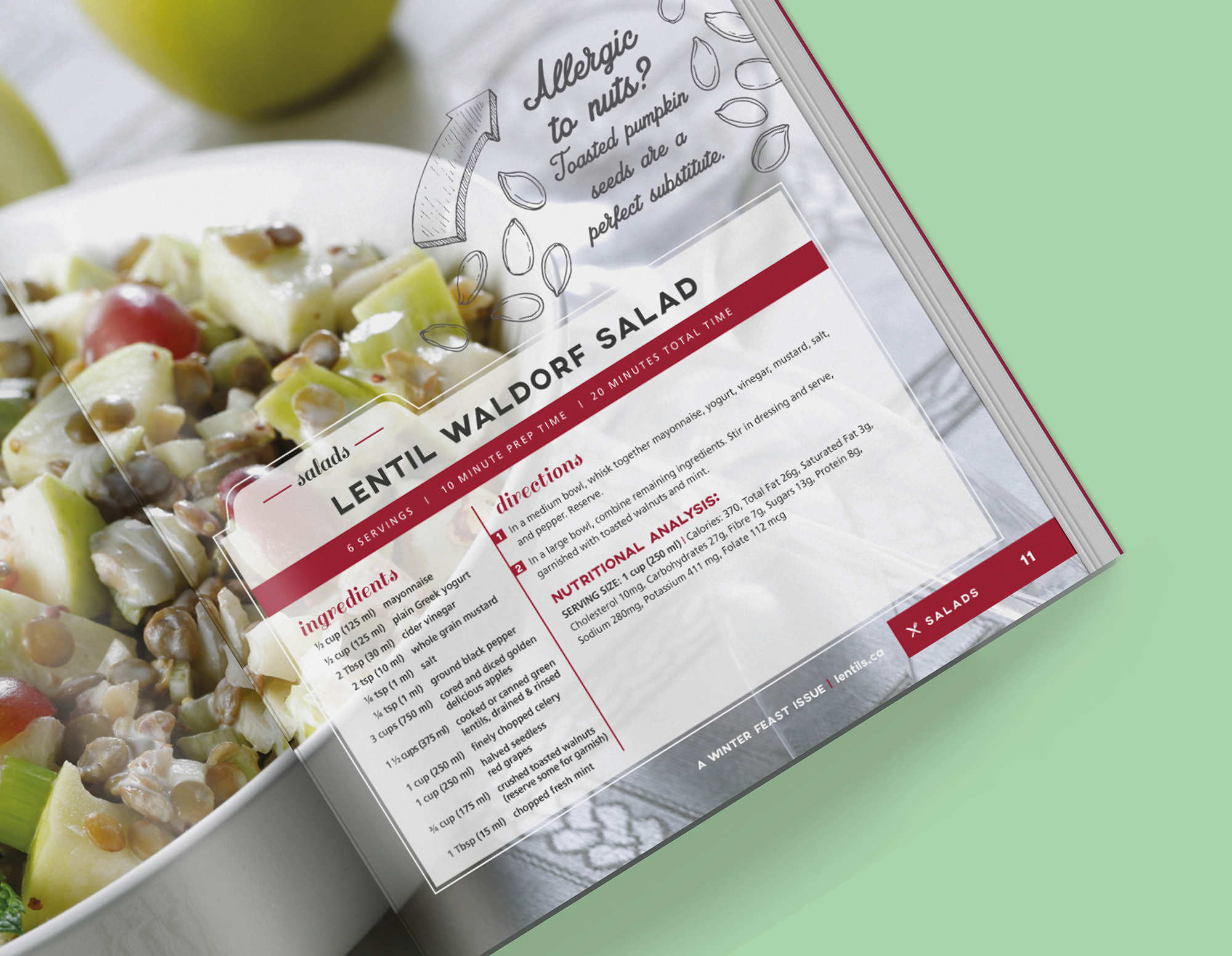
Digital Magazine - templated every quarter
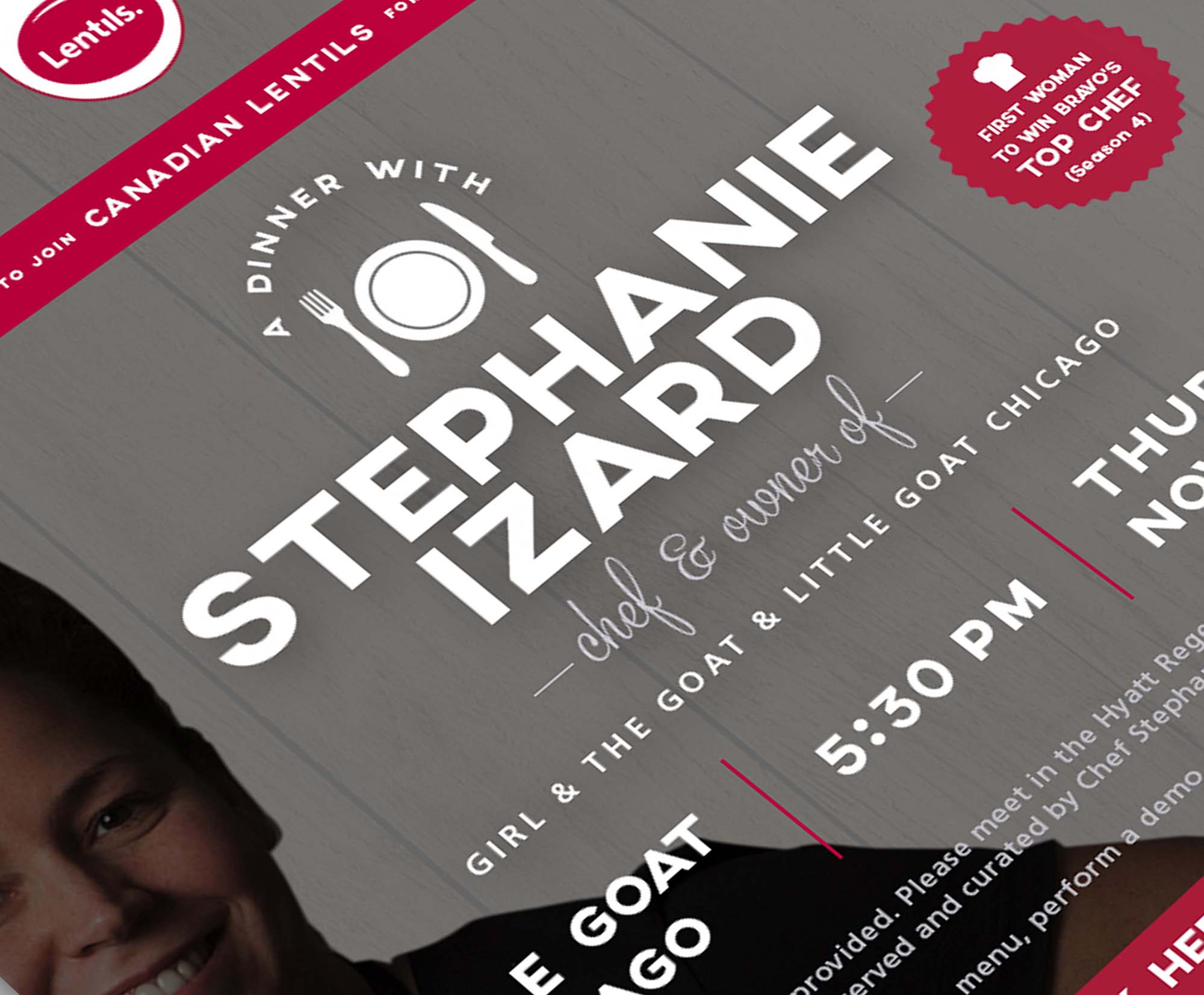
Event EDMs
Print Advertising
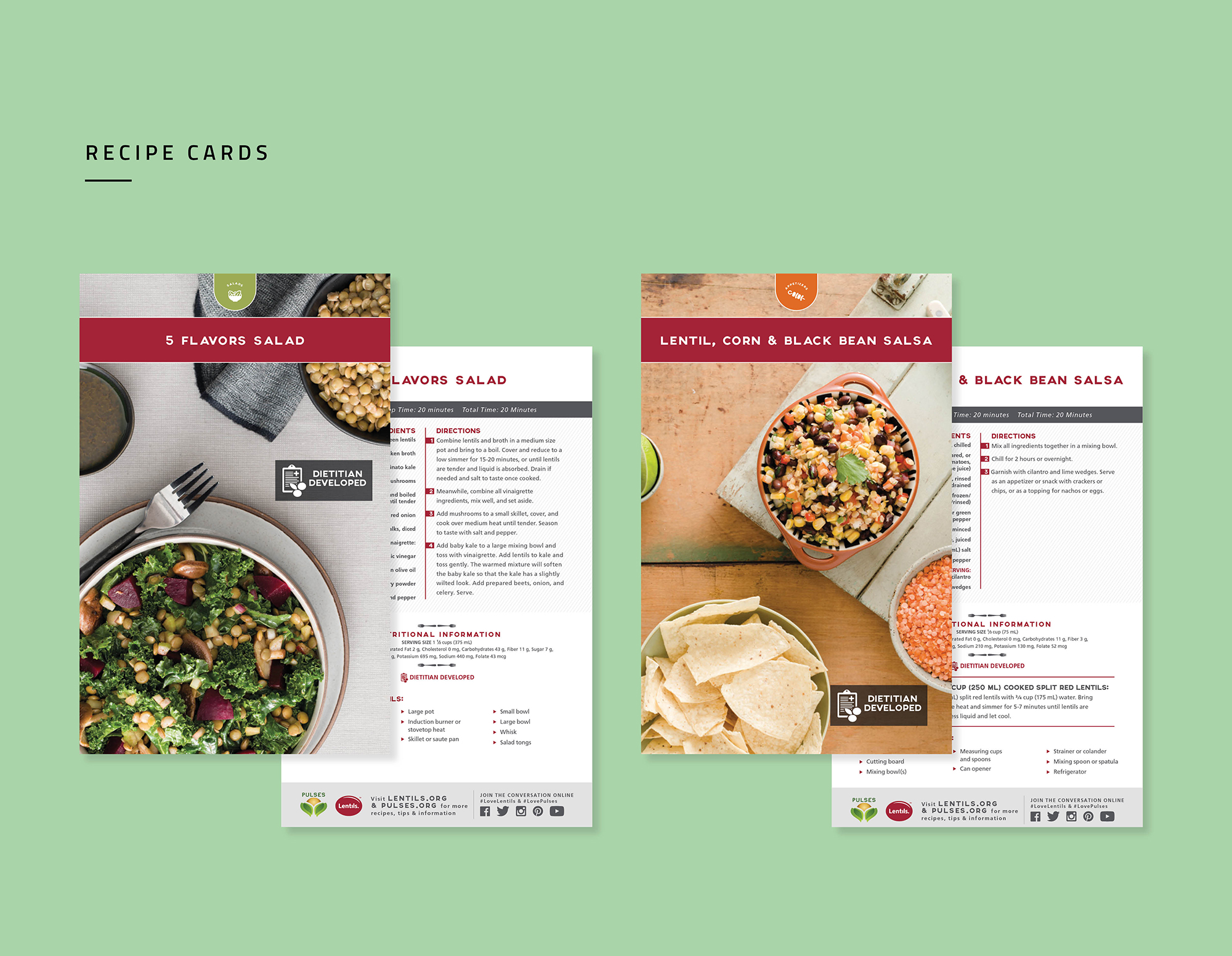
Recipe Cards
Website banners
Trade Show Booth Design -
Category
Branding
Print Design
Publication Design
Digital Design
Brand Roll-out