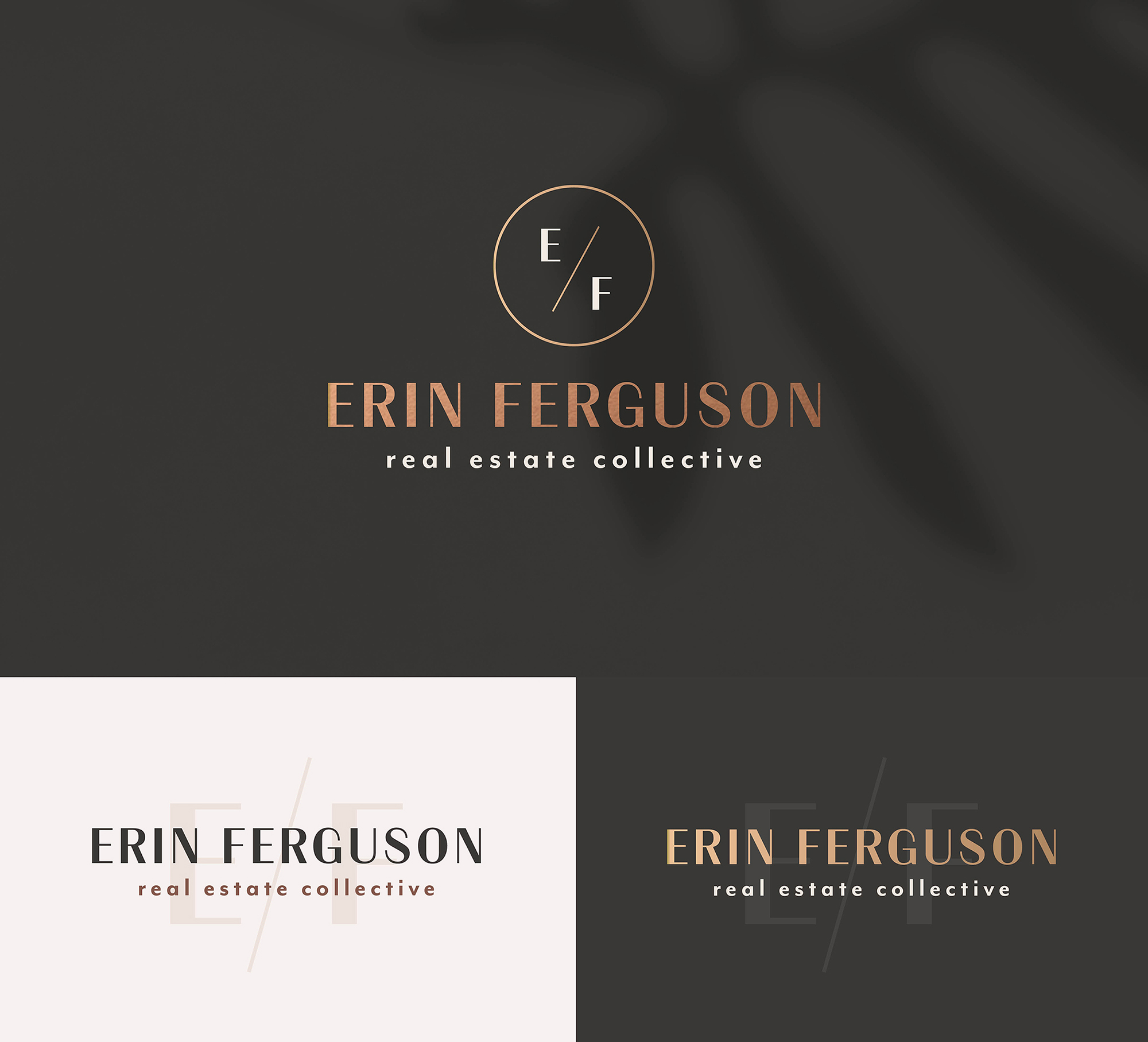
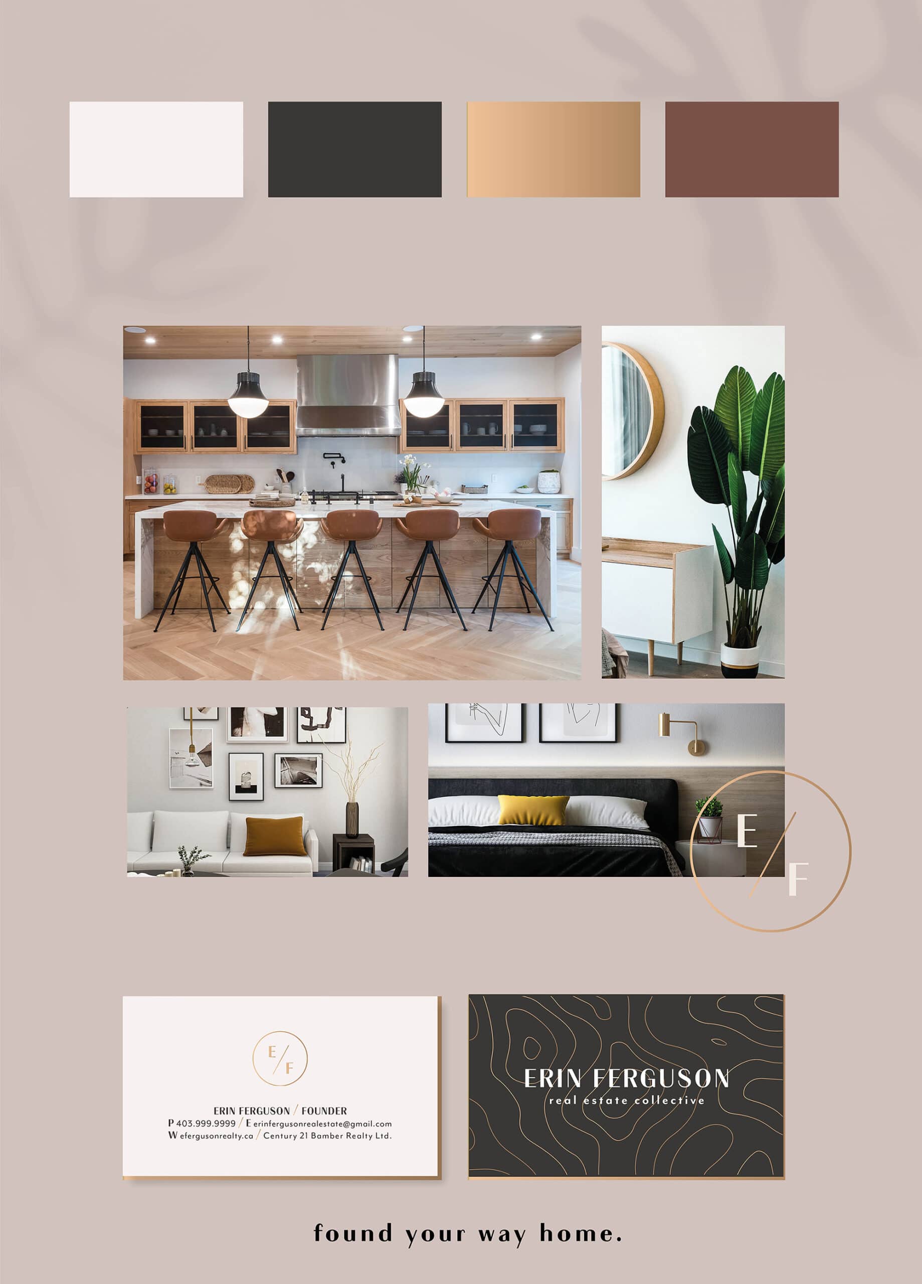
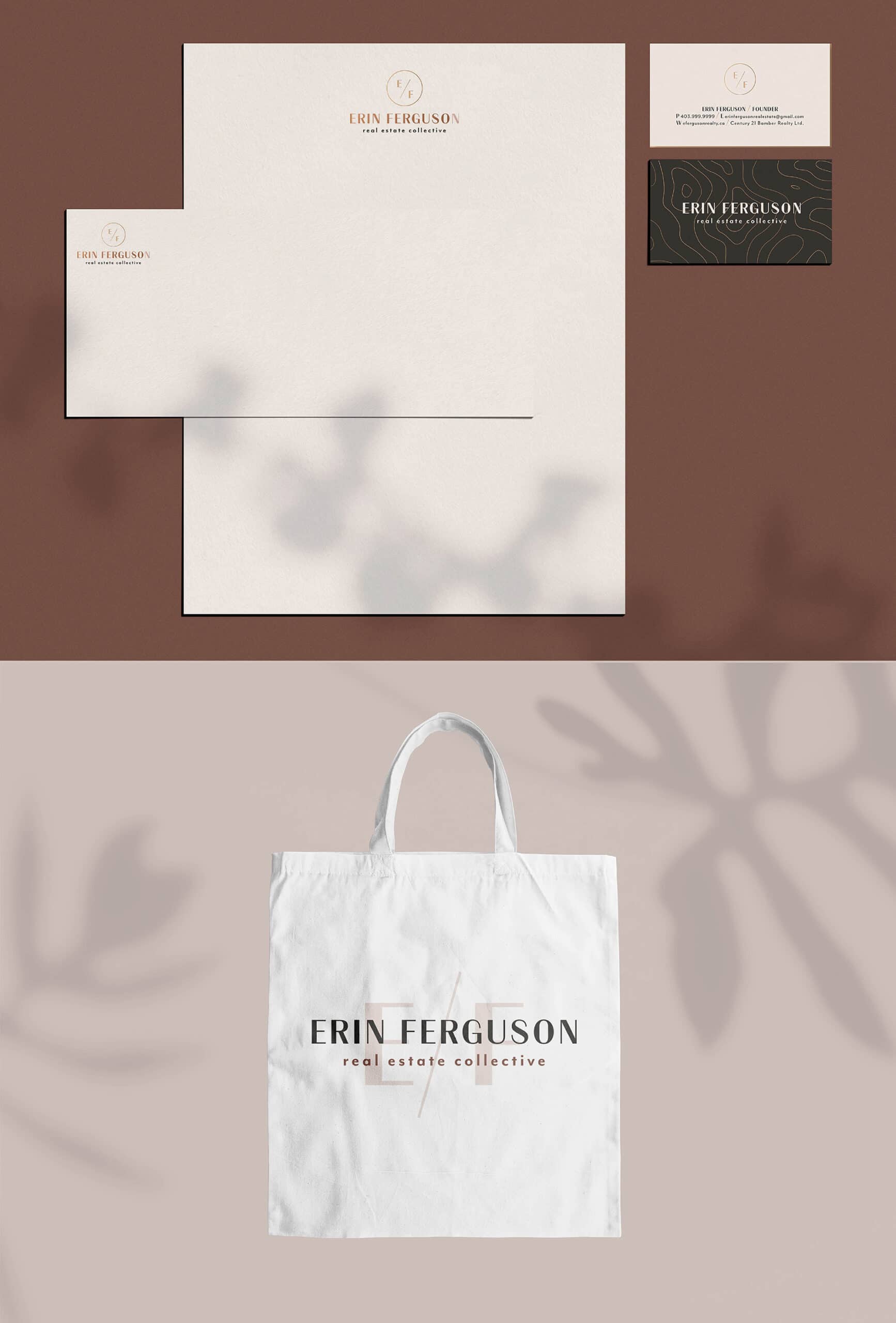
I created a bold, timeless minimalistic word mark for a local Calgary Realtor – which can be adapted in many formats. Rose gold foiling was added to give materials a luxury feel that clients can trust.
The font creates visual interest with its contrast of thick and thin lines, that also define a feminine side but still bold enough to stand out. Using classic, neutral tones with high contrast reinforce a timeless yet trendy logo mark that will last.