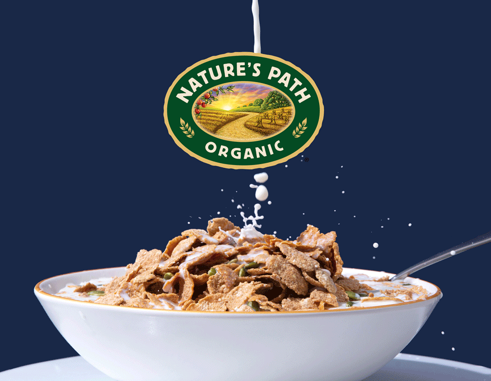
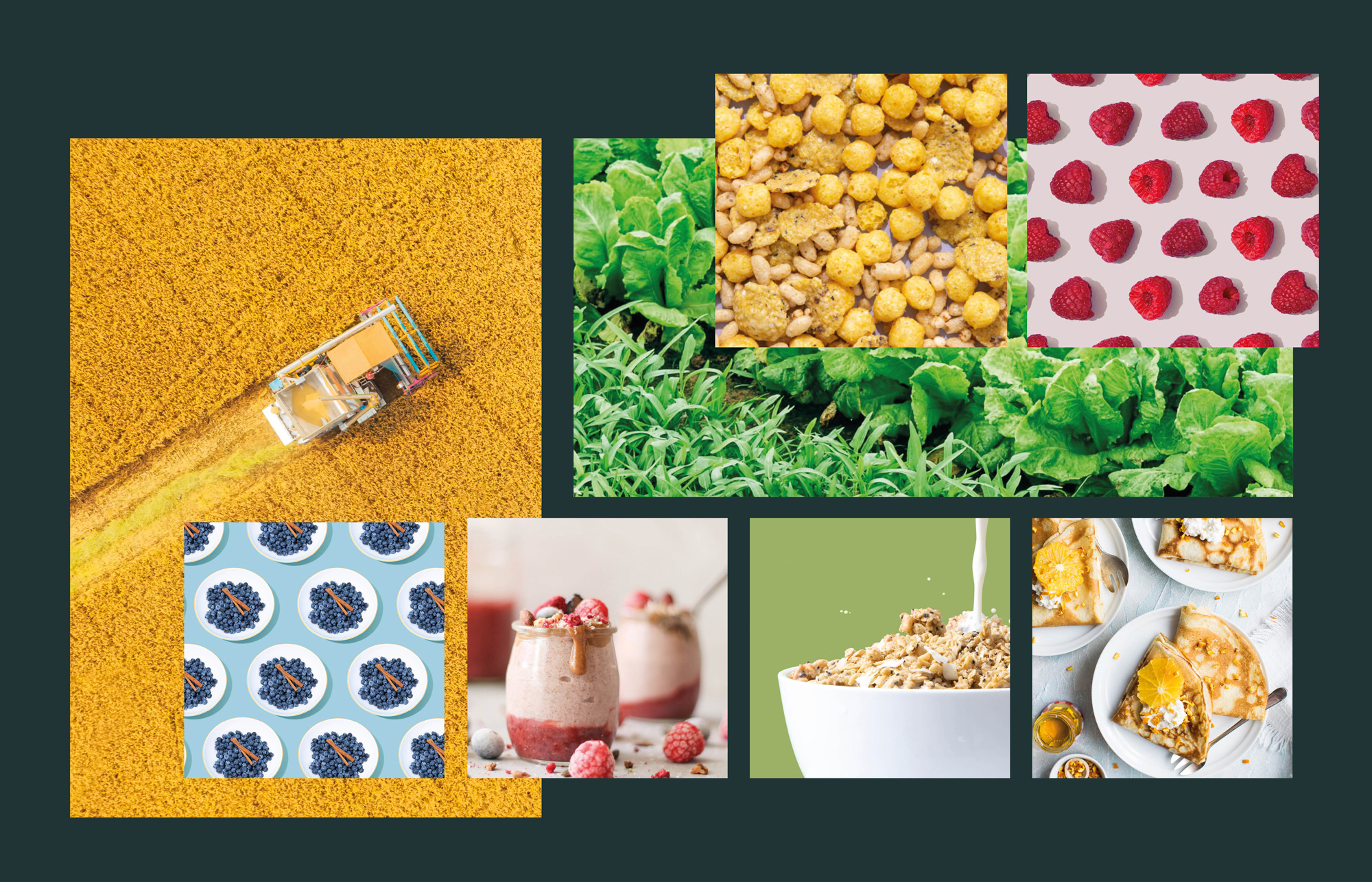
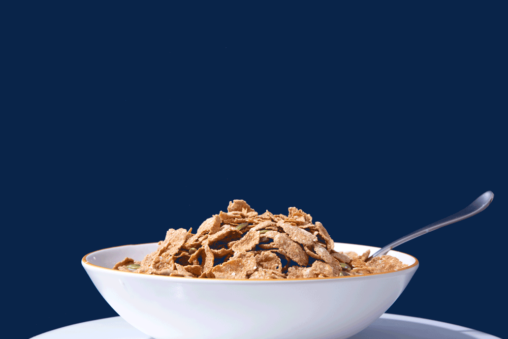
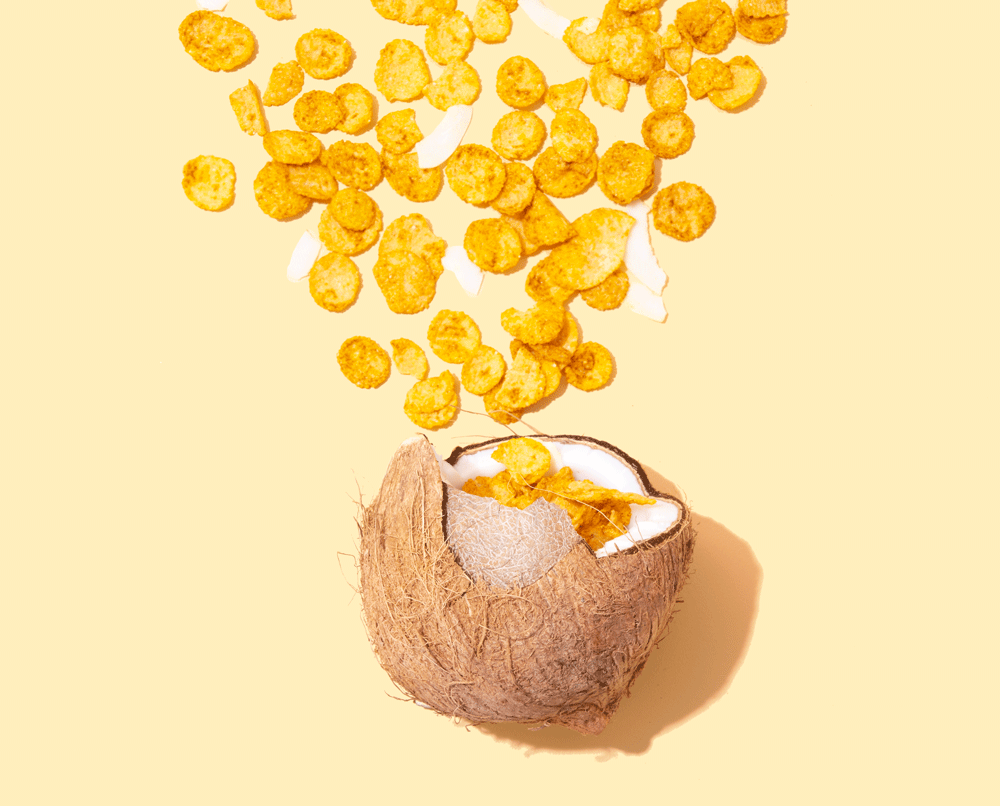
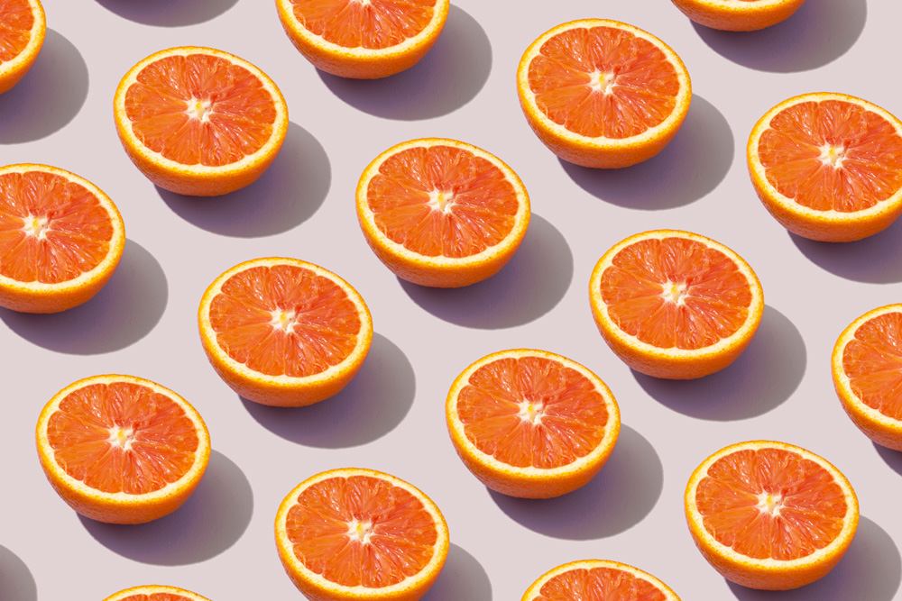
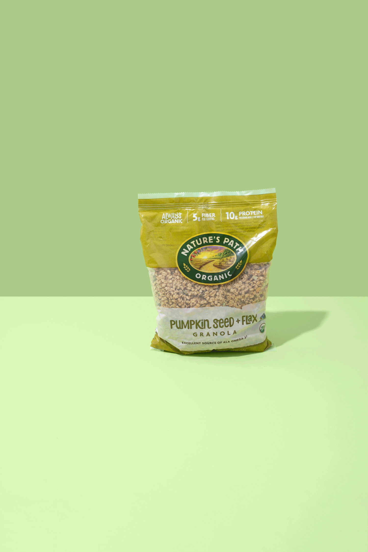
As the Art Director for Nature’s Path, I was leading a full rebrand with an objective to focus on the quality of its organic ingredients.
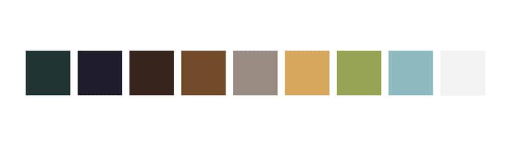
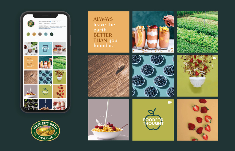
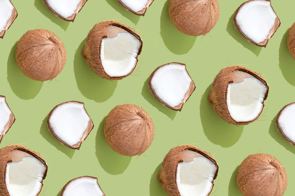
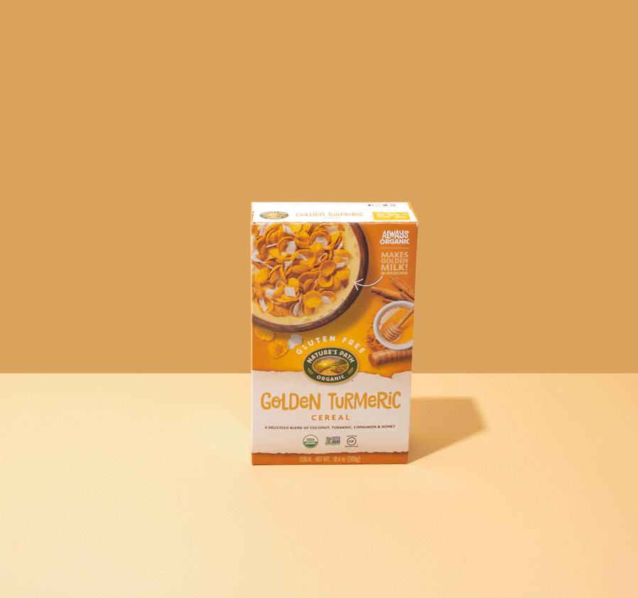
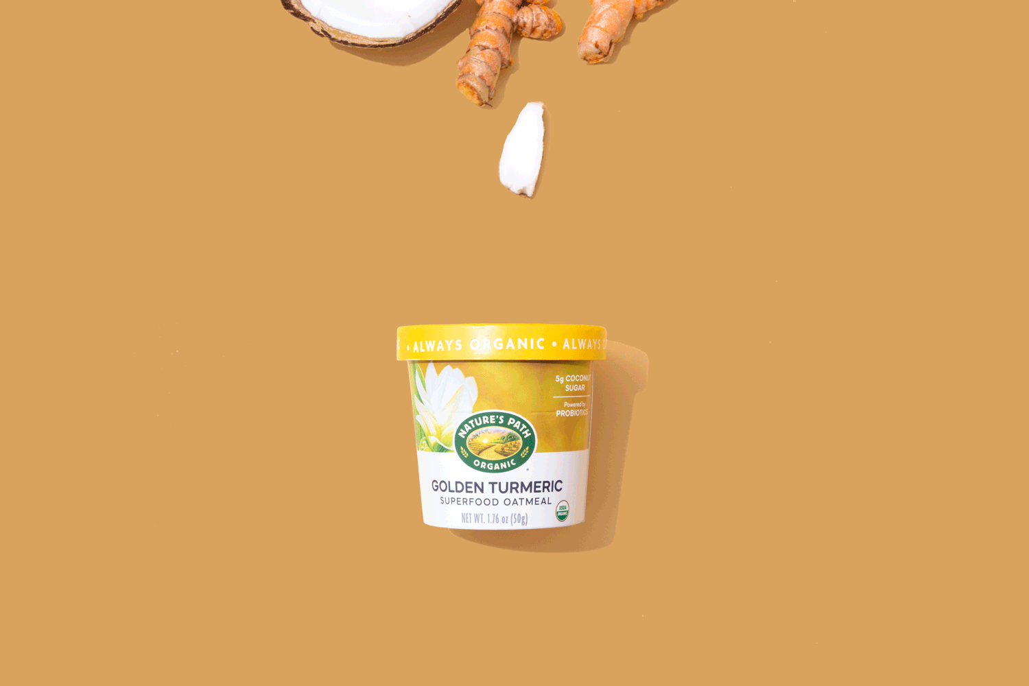
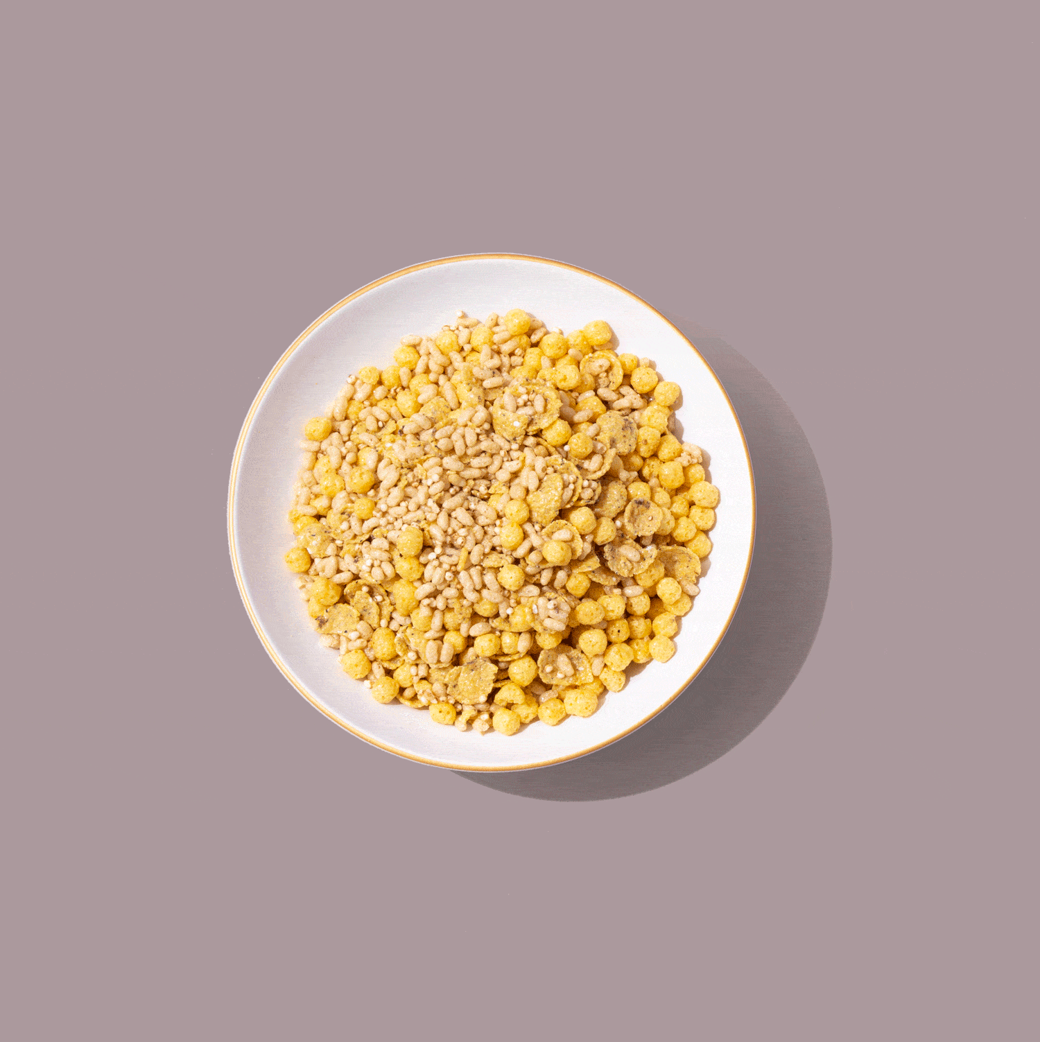
I wanted to create a clean, bright, positive colour palette that complimented their current brand, but also bridged the gap of the new brand that was being tested. To create a unified brand foundation, I led a creative photoshoot focusing on ten top products with intention to animate them, where we focused on the products, ingredients and fresh topping options in bright, visually appealing patterns.
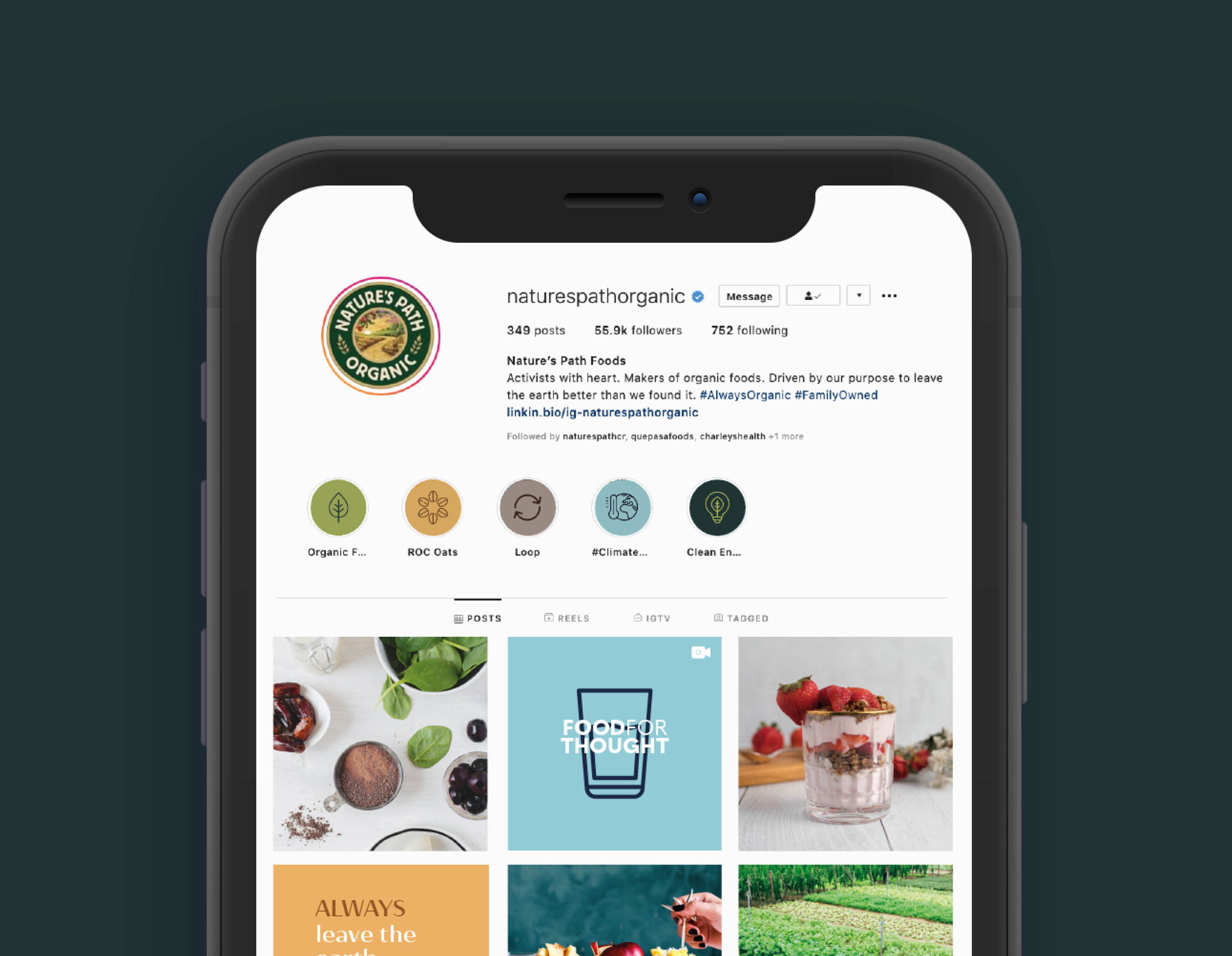
These bright images were created to build the brands foundation while being paired with simplistic colour block text treatment posts, creatively shot UGC, and organic farming informative posts.
INCREASE IN FOLLOWERS
+0K
Company
Nature's Path Organic
Project Date
2021
Location
Vancouver, British Columbia
Category
Branding
Art Direction
Social Media Strategy
Digital